Sketch Club
Sketch Club Poster Design
A few years back, I ran an open drawing session, one night a week for students and staff on the local campus. The event was to provide students with an opportunity to work on their drawing outside of the confines of classes and assignments.
To help promote it, I decided to create a poster & logo for print and a Facebook presence. I toyed around with lots of ideas but settled on a simple illustration of costumed characters armed with drawing equipment. Most of the drawing sessions consisted of a model in costume so this idea seemed like a simple fit.
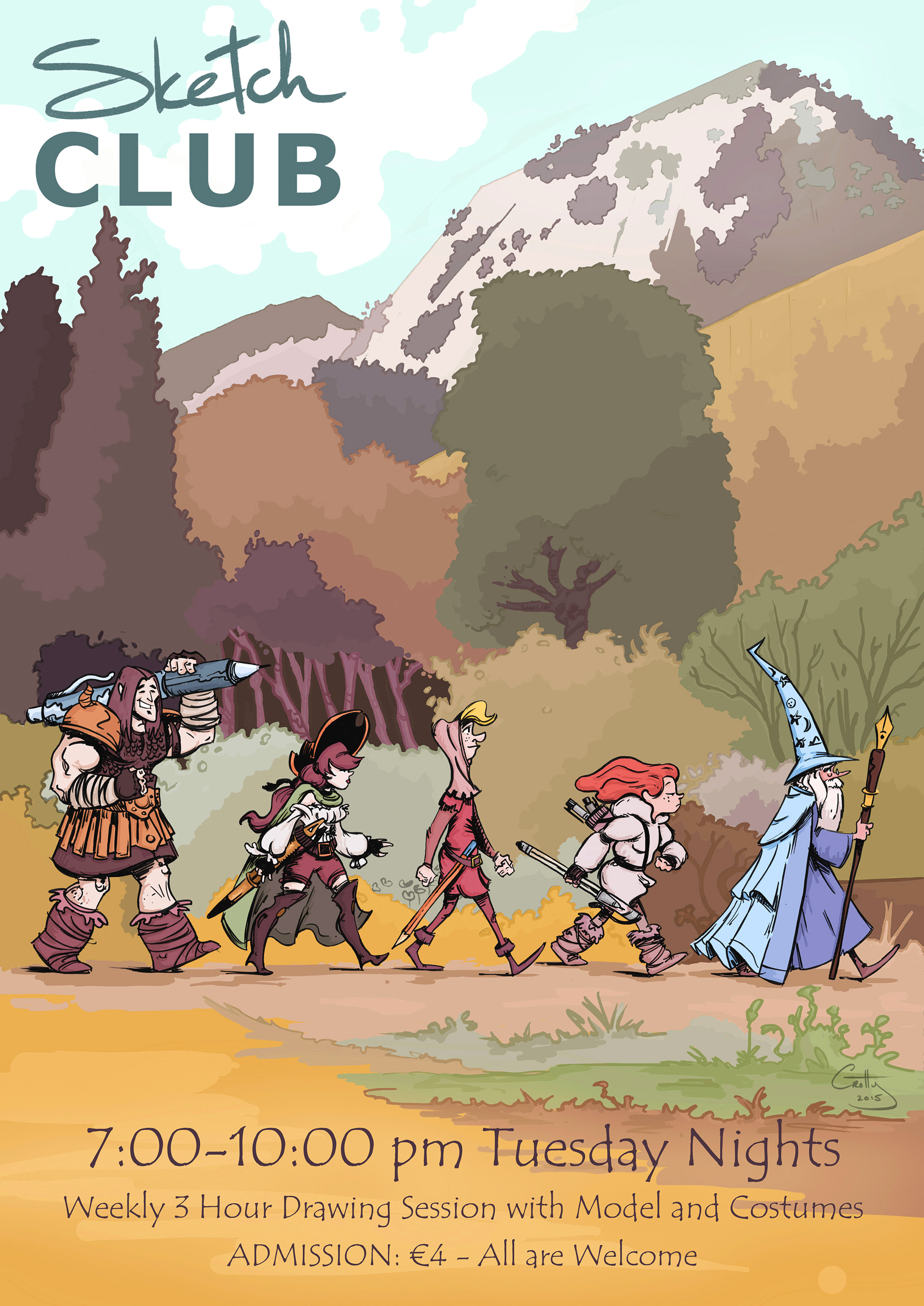
Final Poster Design for Sketch Club sessions. The poster was created beginning with a traditional hand drawn sketch, followed by traditional inking before scanning and colouring in Photoshop.
Sketch Club Poster Design Process
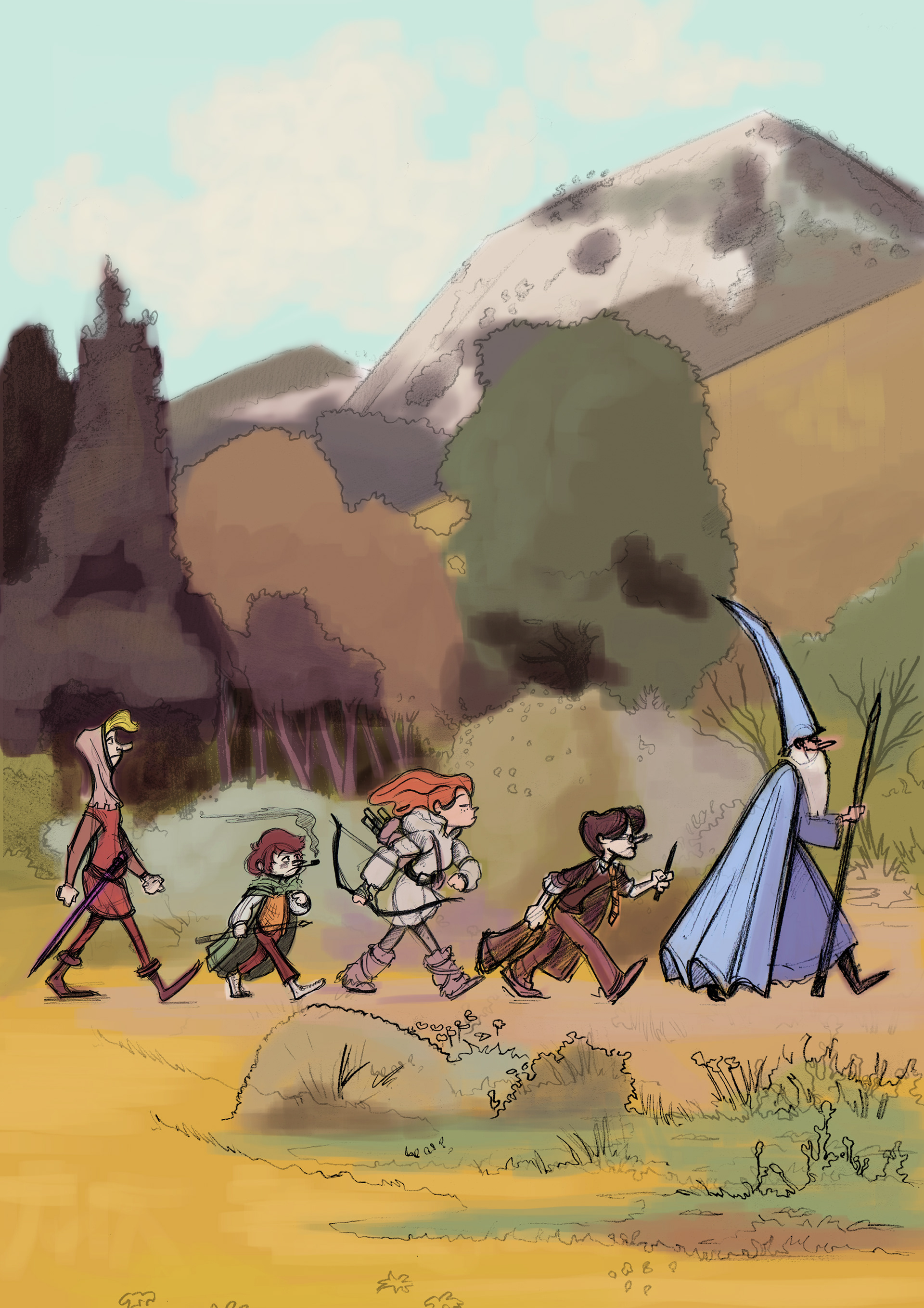
After roughing out a bunch of characters in a sketch book, I had a basic line up and set about comping together the poster layout in Photoshop. I scanned in my rough characters, made some adjustments and changed some characters completely before printing them out at a larger scale and cleaning up the rough designs for each character. This is where I refined the designs and poster layout beyond the very rough stage. I also mocked up the background artwork on a separate page and scanned it into Photoshop. With the characters cleaned up and the layout scanned in, I set about comping the poster and experimenting with type and logo designs.
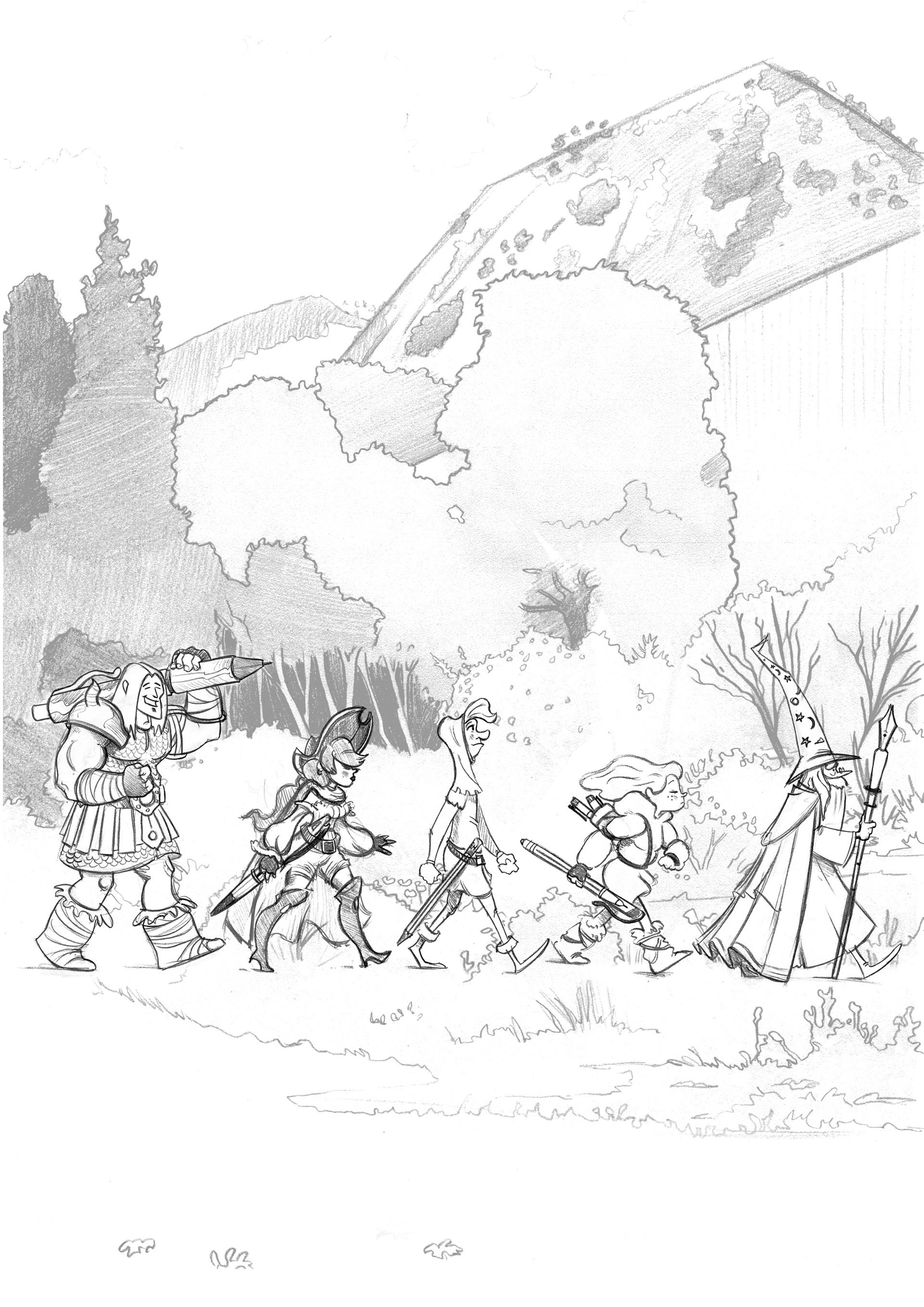
Original Line up with rough colour comp created in Photoshop (Left). The line up changed and a final line art comp was created on paper (Right).
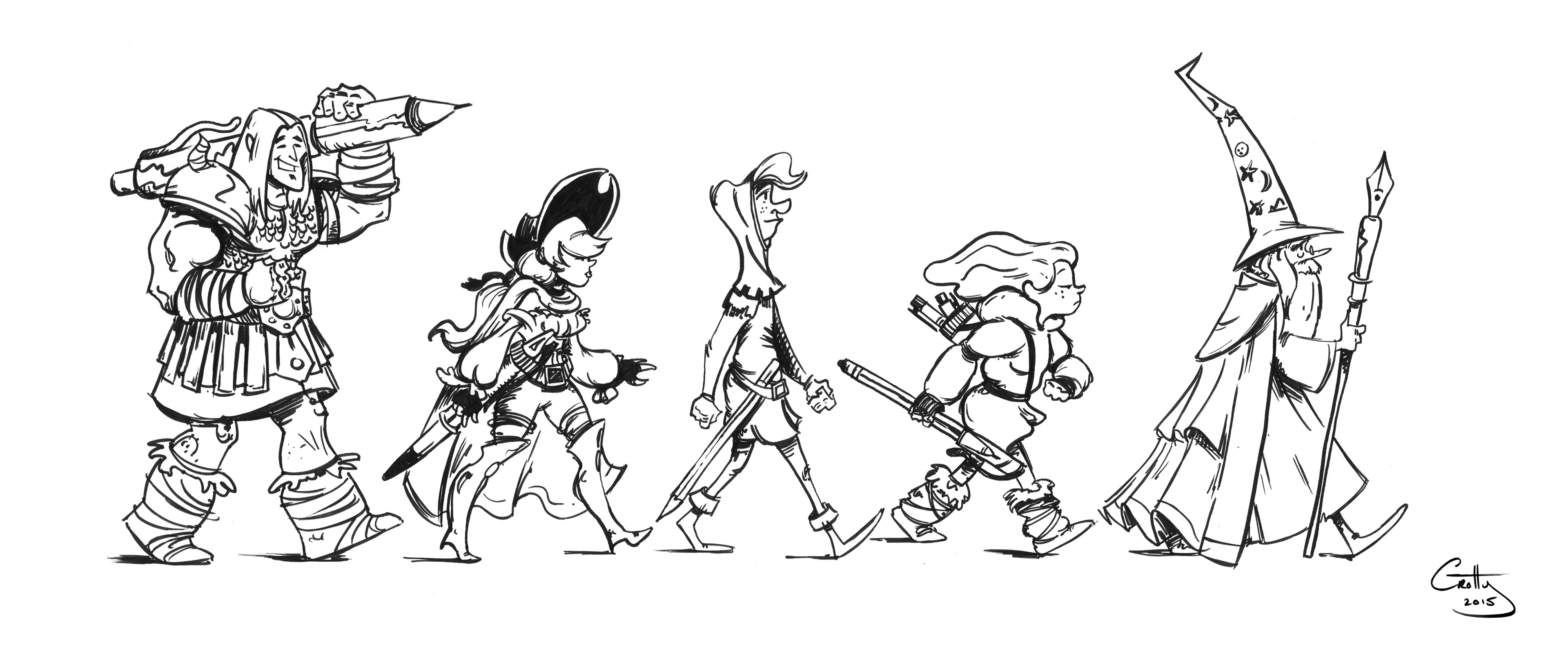
Traditionally inked character line up completed using Faber-Castell PITT Artist Pens.
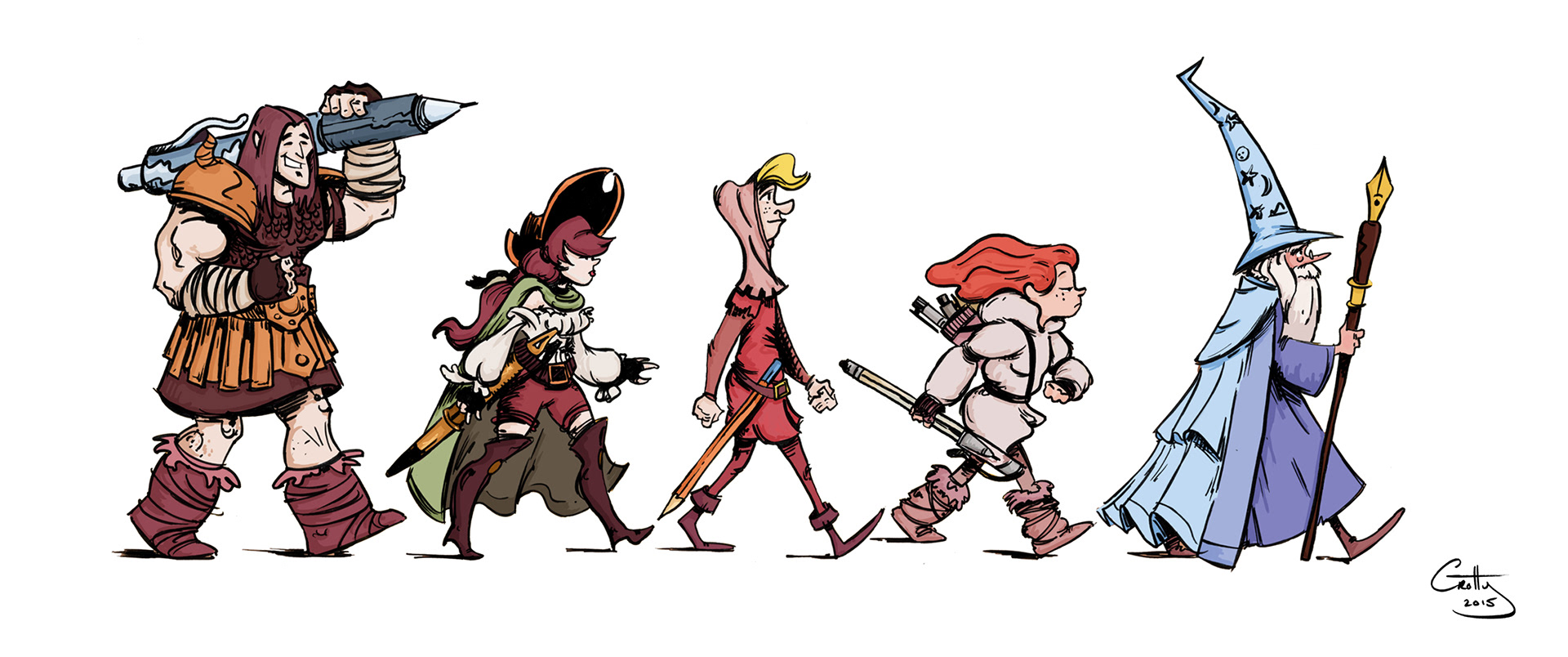
Final inked character line up scanned and coloured digitally in Photoshop.
With the layout working, traditionally inking the characters and background artwork was next. I used the Faber-Castell PITT artist pens which include some brush pens which I had wanted to try out for a while. The inking style was influenced by Skottie Young and Bill Watterson. For me, the traditional inking process is still faster than digital inking partially because of the scale I’m working at and the fact that you can’t screw it up and that pressure leads to more focus and less meandering over lines and placement.
A selection of Logo concepts blending traditional hand written text with digital typography.